Thursday, December 8, 2011

Visual Techniques


Contrast
Boldness
Sharpness


Instability
Exaggeration
Activeness
Depth
Statis


Simplicity
Symmetry
Balance
Singularity


*I couldn't choose just two so I decided to contrast 3...


These images differ in various ways but mainly in their interpretation. The way they are structured cause the viewer to interpret them differently. The first image is bold and colorful, giving off a completely different expression then say the third image. The first image is very bold and straight-on, where as the second image has a contrast in itself with one side of the layout exhibiting stasis and the other side activeness. 


The second image and the third image differ in the sense that although they are both black and white images, they exhibit differing senses of balance and symmetry. The second image is exaggerated in the sense that the woman on the right side of the page is altered to look like the alphabet. The other side (left) of the image is static and unstable, creating depth in the layout. The third image is completely different in the sense that it is a very much balanced layout, with the two main components of the layout on two opposite sides of the pages, relatively the same size as well, not to mention the same color. 


These differences in visual techniques in these magazine layouts create varying interpretations. The first being an immediate colorful burst impact on the viewer. The second image being an interesting composition to look at due to its contrast of stasis and activeness as well as a depth component. The third image being a very clear and simple interpretation, due to the symmetry and balance. 

Thursday, December 1, 2011

Contrast

Good Contrast


The first example of good contrast in design is a well known advertisement for the Apple iPod. The contrast is in the color of the girl listening to the iPod and the color of the background. It's an obvious contrast in color but the simplicity makes the advertisement stand out and is easy to identify.

The second example is of a magazine layout. The contrast in this piece is mainly in color between the black and grays, with the contrast in the title that's in yellow. The tones in the picture of the man is also adding contrast to the composition. 


Bad Contrast


The example above is of a MySpace layout. The contrast in the multiple colors is quite obvious upon the first look but the overload of different shapes and colors strays away from the ability to actually read it and it causes the viewer to lose interest. There is way too much contrast in the types, color, and sizes of the various components of the layout that it isn't successful at all. 

Thursday, November 17, 2011

Implied Movement


This advertisement is an example of implied movement in type. The type is altered to look as if the poster is bent. Although it is 2-D design, the altercations made to the type cause the viewer to relate it to an example of a bent poster they've maybe seen before. The artist made the image look realistic in the sense of a piece of paper that was bent out of shape, which implies a sort of movement. Although it's not actually moving, it implies movement to the viewer due to the relatedness in it's movement of type.


The image above is a 2-D design of a person "balancing" the earth on their finger. This is an example of implied motion because we are able to relate this image to one we have probably seen before and are familiar with which is someone spinning a basketball on their finger in order to balance it. The rings around the earth that are shown imply that it is spinning due to the implications we have made that if there are rings around something that should move, it is indeed moving. The fact that it is being balanced on a finger simply adds to these implications that the "earth" is spinning on the finger shown. 


The image above also shows implied movement mainly due to the fact that a small object (the Lego piece) is standing still in the foreground as the image of the taxi is in the background, blurred. The blurred effect of the the taxi implies to the viewer that it is moving. 

Thursday, November 10, 2011

Dimension/Depth/Space/Scale


http://bestdesignoptions.com/?p=4076

This image is an example of relative height. The sprinkler in the image is shown getting smaller as the depth increases. This is shown by relative height because the height of the sprinkler decreases as it nears the horizon line. The angle of the photo allows the viewer to see that the sprinkler is further away than the viewer. The perspective in the photo represents that the sprinkler is angled and the end is far away. The convergence of the sprinkler lines helps the viewer identify the perspective of the photo. The photo would not have the same composition if the sprinkler was shot on a straight shot rather than at an angle. 

Thursday, November 3, 2011

Tone and Color

1. 

2.

3.

4. 

Tone

a. In these four images of various magazine layouts tone is very much apparent. In image number one the tone of the different colors shown (blue, yellow, pink) are not as strong to exhibit the feeling of the article. The article exhibits more of a "fluffy" feel and is quite the opposite of the feeling in image number four where the tones of red are very strong and exert a very different feeling. The tones of various reds in image four illustrate a strong and direct feeling. 

b. In image number three, tone works with shape in which they relate to each other throughout the layout. The color yellow in the layout is a reoccurring theme and shape in the layout. The typography has a bright yellow and a similar tone of yellow is shown in various box shapes in the layout, creating a unity in the piece. 

Color

a. In each of these images color is represented in various ways. In image number one color is used to separate the different parts of the article and to decipher what you are reading. The various parts of the article are separated by color to help the reader know they are reading about something different. Color is used as an aspect of unity in image number three because the type is in the same red as the red in the lining of the dress the model is wearing on the left side of the page. This color unity helps the viewer connect the pieces as a whole. 

b. Color interacts with line in each of these images. In image one the different lines or scalloping of color in the layout work with color to create differentiation. In image two the block line of subtle peach/nude color across the page adds to the layout. The lines of color in image three separate the different elements in the layout (the yellow lines). 

Thursday, October 27, 2011

Fashion Design

Texture

This dress exudes a variety of textures ranging from the ridging on the sleeves and the bottom of the dress to the silkiness of the base of the dress. The texture of the dress varies in different parts which makes the dress much more interesting to look at than if the entire dress was the same texture. It gives the dress depth and a diversity layers that really adds to the dress. 


Color

This dress immediately screams a pop of color when the viewer first sees it. The unique orange/red color of the dress sets it apart from other "normal" dresses and helps make it stand out from the rest significantly. If this dress was not a bright color, I don't think it would have the same "shock" effect that it has on the viewer that it has now. Color in this sense took a large role in establishing this dress to be a strong fashion statement. 
Shape


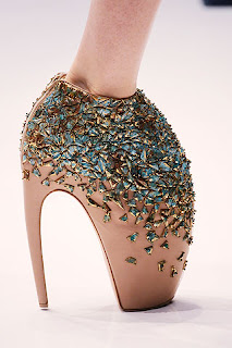
This Alexander McQueen shoe uses shape as a method of identification. many of Alexander McQueen's shoes have the same shape which allows consumers to recognize his line much more easily. Upon first look, the shape of the heel looks unbearable to wear although they are seen on the runway. The shape of the shoe alone is a statement, without even taking the extravagant jewels into consideration. 


Thursday, October 20, 2011

Gestalt

BRACELET


I first looked at the different shapes and made sure there were the same amount of triangles and circles as the other surrounding bracelets and then saw that there was so I moved on to another tactic. I noticed that there were different shadows on one bracelet than the other two. I would say that I used the “visual induction” technique according to the McKim reading. I inducted that there was a specific shadow that was different than the other two bracelets so I chose he two bracelets to the left as the ones that are identical. I also used “perceptual speed” to match and compare the bracelets to the others and it’s characteristics using pattern recognition. 

My partner used similar tactics. At first she didn't notice the difference in the shadows but then she noticed it. 


CAT PUZZLE


I first looked at the cat as a whole and noticed that the entire image was made of different sized triangles and I first counted the most obvious ones. This technique is called “pattern-seeking” because I was looking for a familiar shape; the triangle. Like the McKim reading states, I “found a desired pattern embedded in distracting surroundings.” After counting the more obvious ones I looked at the image closer and noticed on triangle could be counted for another. I counted 19 triangles total.

My partner used the same techniques. She first noticed the more obvious triangles by using the “pattern-seeking” technique. She then looked more closely and noticed there were more triangles. She first found 17 triangles and then counted 19.