Thursday, October 27, 2011

Fashion Design

Texture

This dress exudes a variety of textures ranging from the ridging on the sleeves and the bottom of the dress to the silkiness of the base of the dress. The texture of the dress varies in different parts which makes the dress much more interesting to look at than if the entire dress was the same texture. It gives the dress depth and a diversity layers that really adds to the dress. 


Color

This dress immediately screams a pop of color when the viewer first sees it. The unique orange/red color of the dress sets it apart from other "normal" dresses and helps make it stand out from the rest significantly. If this dress was not a bright color, I don't think it would have the same "shock" effect that it has on the viewer that it has now. Color in this sense took a large role in establishing this dress to be a strong fashion statement. 
Shape


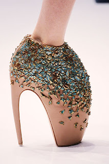
This Alexander McQueen shoe uses shape as a method of identification. many of Alexander McQueen's shoes have the same shape which allows consumers to recognize his line much more easily. Upon first look, the shape of the heel looks unbearable to wear although they are seen on the runway. The shape of the shoe alone is a statement, without even taking the extravagant jewels into consideration. 


Thursday, October 20, 2011

Gestalt

BRACELET


I first looked at the different shapes and made sure there were the same amount of triangles and circles as the other surrounding bracelets and then saw that there was so I moved on to another tactic. I noticed that there were different shadows on one bracelet than the other two. I would say that I used the “visual induction” technique according to the McKim reading. I inducted that there was a specific shadow that was different than the other two bracelets so I chose he two bracelets to the left as the ones that are identical. I also used “perceptual speed” to match and compare the bracelets to the others and it’s characteristics using pattern recognition. 

My partner used similar tactics. At first she didn't notice the difference in the shadows but then she noticed it. 


CAT PUZZLE


I first looked at the cat as a whole and noticed that the entire image was made of different sized triangles and I first counted the most obvious ones. This technique is called “pattern-seeking” because I was looking for a familiar shape; the triangle. Like the McKim reading states, I “found a desired pattern embedded in distracting surroundings.” After counting the more obvious ones I looked at the image closer and noticed on triangle could be counted for another. I counted 19 triangles total.

My partner used the same techniques. She first noticed the more obvious triangles by using the “pattern-seeking” technique. She then looked more closely and noticed there were more triangles. She first found 17 triangles and then counted 19.


Thursday, October 13, 2011

Visual Perception


Target Advertisement in New York City
http://1.bp.blogspot.com/_fovzC1ZducQ/TOF6ghDrrAI/AAAAAAAAAhk/EPsRZMfeNRc/s640/ny_times_square_target_advertisements_199.jpg

The advertisement above represents the visual hierarchy in a number of ways. First of all it is very obvious that they ad is for Target due to the recognizable colors of the company, and the repeated symbols representative to the company. Shape channels and color channels are the most recognizable to the viewer right away. When you look at the advertisement the viewer can detect the Target logo repeatedly, representing the color channel being used. The idea of "the presence of preattentive feature is more effective than its absence" is being used in this series of advertisements, in relation to the logo. The visual hierarchy is the following: the color channel detection (red and white), shape channel (Target of logo, of a target), and the repetition of these symbols in the series of advertisements next to each other. The viewer can immediately tell that the advertisements, although they are on multiple panels, are related to each other due to the visual channels they have. The advertisement causes the viewers eye to move around this city block to see the relationship between each of the advertisements because they realize they are interrelated.

Thursday, October 6, 2011

Top-Down Processing

[M&M company]

This advertisement is an example of Top-Down Processing because the viewer is forced to perceive the image the artist is trying to portray but not so obviously. The M&M's are in the shape of a keyboard, suggesting a form of communication, which is what they are trying to advertise. The process the viewer has to go through visually is, looking a the ad, noticing they are M&M's in the shape of something similar, and then they figure out that the familiar shape is the order of a standard keyboard. This advertisement catches the viewers attention and then causes them to visually perceive it to accomplish the artists' "goal."

[Clorets]

This is another advertisement that exhibits the Top-Down process. The picture is of someone sticking, what first appears to be a tongue out, but if you look more carefully the viewer notices it's actually a fish. The advertisement catches the viewers attention because they are used to this image if it were a tongue because it's somewhat conventional, but when they automatically think that and then actually realize what it is, it causes them to look again. This process of linking stored information with the advertisement is the process of top-down processing.